Originally, we wanted the Yakuza members, of Asian origin, to be aged 30-50. However, we were unable to find any willing participants. We had to ask our friends to be part of our trailer instead.
Sunday, 1 February 2015

Thursday, 29 January 2015
Final Drafts and The Process: Magazine Front Cover and Poster
Here is the feedback I received from my tutor about my magazine:
"I think the cover has a brilliant image but the sizing and wording of the sell lines needs more attention as does the additional images - they are fading into background too much and need something to pull them out to differentiate them from the main image"
From the feedback I received from my teacher and peers, I decided to strip my magazine front cover of the sell lines and external images. I was told that the stills of different movies detract from the main image therefore I got rid of them and decided to redraft the sell lines and the font I used because it looked too basic.

Starting with a blank canvas (almost), main changes include the headline typography to match the film poster, image has been darkened - shadows and highlights intensified in contrast. Addition of Twitter and Facebook links above barcode and slogan/issue number above the masthead in small writing.

Experimenting with typography and potential colour schemes. Playing around with the layout, position of sell lines and space around the main image.

Change of typography and colour scheme again, addition of language and features, inclusion of symbols i.e. arrow. Choosing fonts is not my forte so I read an article on the most popular fonts used by designers and came across the Franklin Gothic font. It is a Sans Serif bold font which suited the house style of my magazine better than the font I used in the first draft and in the drafts above.
I also experimented with the colour scheme because my first draft was too plain. This time around, I used a vibrant mustard yellow, an intense orange with hints of red, white and grey. Eventually I decided to just use the original colour scheme and hints of red and white.

From start, to redraft, to the final drafts

Final Drafts: I reverted back to the original colour scheme because it complimented the darkness in the images. I also changed the font from Franklin 'Gothic to Antonio' and added an additional features such as links to twitter and facebook, an arrow button and a plus sign.
1

2
After reviewing the arrow, I realised it hindered the effectiveness of the main images because it covers a lot of the background image so I made the triangle button in the corner to replace the arrow. I also switched the position of the film list and added in two new sell lines on the right and above the headline. I removed the links below the barcode because they interfered with the alignment of the barcode and the headline.

Final Magazine Cover:
Once again I developed the colour scheme by adding red text blocks to highlight the different sell lines. I also removed the quote above the headline because it made my magazine look less professional.I added a softened black rectangle over the headline so it looks reflective and I changed the colour of the fonts so that the important parts of each sell line were highlighted.

"There is something very "tarantinoesque" about your poster which I am drawn to. A good image, iconography and well executed film titles but please fix the last line with random words and vampire diaries? 9/10 "
The main issue with my film poster was the readability of the credits (and the content) because the colour was too similar to the detailing on the kimono.


Another alteration I made involved the tagline. I translated "How deep are your roots?" into Japanese using Google Translate and accentuated the English tagline with the Kanji version in grey to strengthen the oriental theme in my poster. I was previously reluctant to use the 'Trajan' font because it is such a common font, however it looked appropriate.
On photoshop I used the smudge tool to spread the colour black that I had applied using the brush tool. This drastically improved the readability of my credits. Finally, I decided to be more generous with the production logos and I added an age restriction which I had copied and pasted from the 'WWZ' film poster because I could not find a grey version of the Paramount logo elsewhere.

Draft 1 vs Draft 2


I covered the grey specks on the bottom left hand side using the paint brush tool on Paint.
Final Draft

Then I placed our production logo on the bottom left hand corner next to the age rating. This is the final poster:

Saturday, 17 January 2015
Storyboarding
I am in charge of scouting locations, planning our filming agenda and transferring our written ideas into a visual storyboard. Ah! Pressure! Anyway, we looked at existing storyboards to determine the conventions to help us grasp the purpose and the quality our storyboard should be.
Here is our initial plan:

We decided as a group to begin the trailer with a black and white close-up clip of a middle-aged man smoking, looking directly at the camera. During the editing process we will include a voice over of a man saying some things in Japanese.

The voice-over will switch from the man to the female lead, talking about her family who happen to be yakuza (Japanese gangsters). The following scene is a flashback of the main characters and their father teaching his son how to fight; a young girl attempts to join in but is shunned by the father and son. Naturally this scene will be a longshot, we decided to shoot this scene outside because the ambient light will provide a calmer atmosphere.
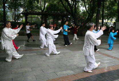
It will then cut to a bar scene where the present-day female lead is conversing with her best friend about the mistreatment she has had all her life to which her friend suggests she should prove her worth to the family.
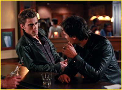
This is also a flashback scene. As the icon for our film is a bonsai tree we will have an upward tilt of a bonsai tree being tended by the younger version of the female lead. This will portray her compassionate nature and will help to show the negative impact the rivalry between her and her brother has had on her growing up because by the end of our trailer she is a completely different person; more vengeful and aggressive.

Saturday, 20 December 2014
Final Draft 1

What could be improved? I think I need to edit the credits because the last line is too close to the symbols and company logos in the right hand corner. The colour isolation effect stands out however I need to go back and edit the edges because if you zoom in you can see a minor grey outline around some of the flowers. I'm not 100% sure about the slogan too; perhaps I need to change the font style because it looks too uniform.

I may need to reconsider the fonts for the sell lines because they don't look as appealing as I would like them to look. I am content with the images on the right hand side however the font for the title beneath the images look somewhat out of place; maybe the colour white is not the appropriate colour... I think I need to edit the barcode to be in line with the bottom line of the headline. I also may need to lighten the male model's shoulders so that his blazer doesn't blend in too much with the background or I could lighten the background. I also need to add a slogan near the masthead. I might edit the sell lines so they are more interesting.
Tuesday, 16 December 2014
Photography
GROUP CHAT

As I am an open-minded person, for me it is important to have variation in photography so as to not limit the possibilities to just the initial idea. To achieve this variation I explored different shots, angles and played around with the focus and props available such as the wooden swords and the gun (which we spray painted black).
Next to the images I took are my inspirations.

As I am an open-minded person, for me it is important to have variation in photography so as to not limit the possibilities to just the initial idea. To achieve this variation I explored different shots, angles and played around with the focus and props available such as the wooden swords and the gun (which we spray painted black).
Next to the images I took are my inspirations.
Sunday, 30 November 2014
Monday, 24 November 2014
'The Bonsai Tree' Film Poster Ideas
'The Bonsai Tree' is a stylised British Japanese gangster film so to enhance my insight, I also looked at Japanese Yakuza film posters.
Our main protagonist is a young woman who possesses a strong sense of self-determination so I looked at existing films that featured a strong female main character. Angelina Jolie has starred in many action films as a character who embodies similar beliefs and traits to our protagonist. I looked at the poster for 'Salt' to help stimulate ideas.


Out of my two ideas I think the first one will do a better job of communicating the genre because of the prop gun and trying to do the smoke effect on Photoshop for the second poster may be time consuming. I have come to the conclusion that the first idea will entice the audience because it is more visually and mentally engaging.
Our main protagonist is a young woman who possesses a strong sense of self-determination so I looked at existing films that featured a strong female main character. Angelina Jolie has starred in many action films as a character who embodies similar beliefs and traits to our protagonist. I looked at the poster for 'Salt' to help stimulate ideas.


One thing these posters have in common is the weapon the character is holding; the weapon helps establish power and authority as well as strength ang the genre. My initial poster is character based with only the main character in it.
For my first idea, I intend to have the model's side profile as my focal image while holding a gun. The actors' names will be placed at the top and the tagline will overlay the model to show that this is possibly what she is thinking "How deep are your roots?" I have decided to make the font dark red because it is a deep colour and will resemble blood. The billing block will be placed at the bottom like in the majority of movie posters.
For my second idea, I wanted to showcase the bonsai tree icon so I drew smoke arising in the shape of a tree and the model wearing a bonsai tree necklace. I subverted conventions here because I placed the billing block at the top of the poster and below it is where I will put the main actress' name.
Here are some Japanese/Oriental looking fonts that I may consider using from dafont.com
Subscribe to:
Posts (Atom)